 Получите свидетельство
 Вход
Вход


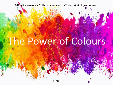
2020 г.
Aim: This study was designed to determine the preferable colours of a group of teenagers and how colours affect on them.
Research objectives:
To identify colour meanings and associations;
To learn colour preferences of the pupils of our gymnasium in life, and, particilarly, in clothes ;
To find out how marketers use colours to make you buy things;
To carry out a survey aimed at making a unified portrait of a group of teenagers;
To establish a list of suitable colours for a uniform and the walls at our gymnasium.
Hypothesis: Colour is energy and it can have a physical, mental, spiritual and emotional effect on people.
Method of Research :
Literature review
Data collection and analyses
Description
Scientific novelty and the practical significance of the study :
The principles developed by the study can be used in everyday life such as practical useage of colours from choosing a uniform for a school to the colour of the walls in the classrooms based on the preferences of the students of that school.
Слайд
Colour is a powerful thing. Colours help us identify specific objects and interpret emotions. We associate many colours with specific human traits. Colours can invoke all our emotions, from happy to sad and love to dislike.
Слайды
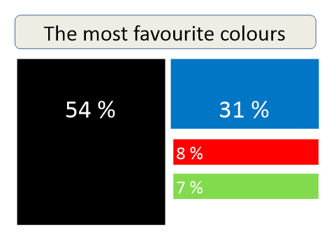
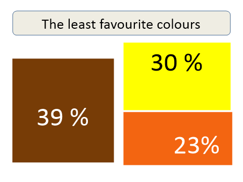
Based on the survey conducted by our group, we’ve concluded that the senior pupils of our gymnasium picked black (54 %) as their favourite color followed by blue (31 %). Though some pupils say that red and green are a close third and fourth respectively. Brown (39%), yellow (30%) and orange (23%) are some of the least favourite colours.
Слайд 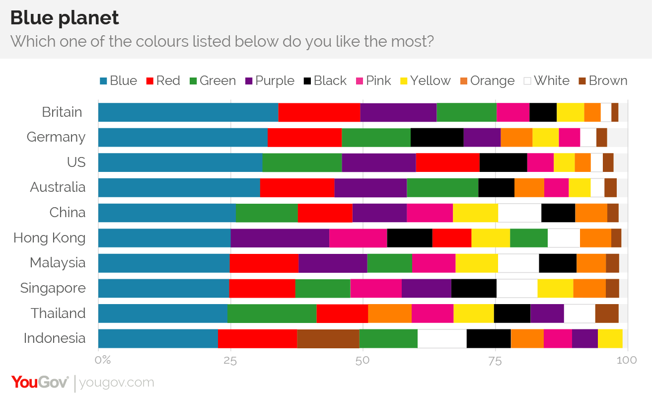
As a comparison,a new YouGov survey conducted in 10 countries across four continents shows that one colour – blue – is the most popular across the board. Then comes green and red. YouGov is a global public opinion and data company which explores what the world thinks.
We can conclude that the main color preferences, which we identified during our survey, a little bit differ from the research of YouGov though blue is at the general level (26%) of the results in this table. But black prevails among the preferences of our respondents and overtake the results of YouGov. As for the least favourite colours,we have a complete match in results: brown,yellow and orange are in the last rows.
Maybe the cause of these differences is in the age of the participants. YouGov's resutls were based on the answers of groups of all age while our ones were based on the answers of 14-17 -year-old teenagers.
Слайд
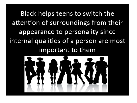
Psycologists point out that black colour helps teens to switch the attention of surroundings from their appearance to personality since internal qualities of a person are most important to them.
This statements explain exactly the nature of teenages. Maybe, when the respondents become older, they will change their choices.
Слайд
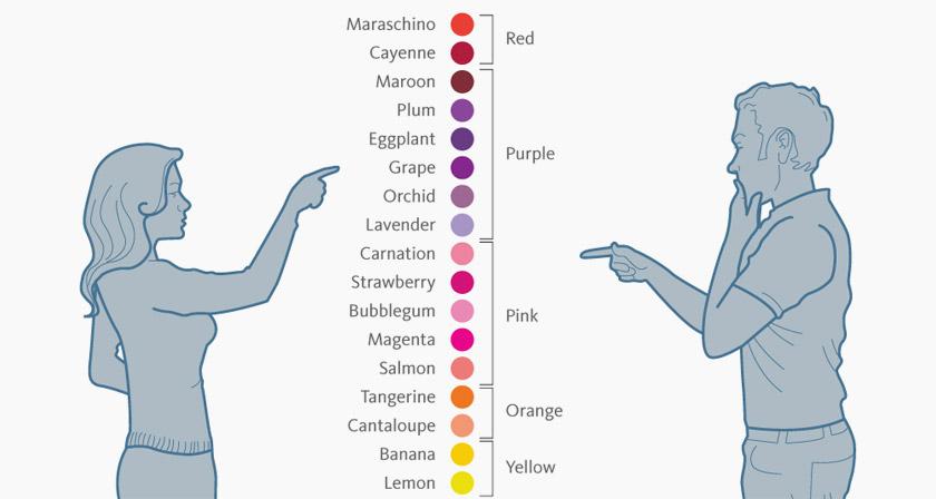
Next,it is said that women and men see colours differently and prefer different colours.The study done by Joe Hallock in 2003 showed that women and men see different shades of colour even when shown the same objects. But the resuts also showed that both men and women like the colour blue.
Слайд
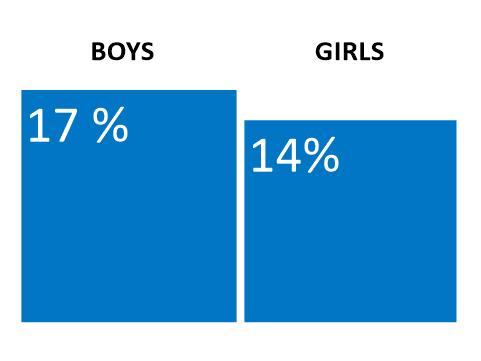
As we said earlier, blue takes the second place among the preferable colours in the group of our respondents : boys make up 17% and girls - 14% This statistics shows the same results to Joe Hallock's research.
Слайд
Then,we were interested in how colours influence our emotions? What do the colours mean?
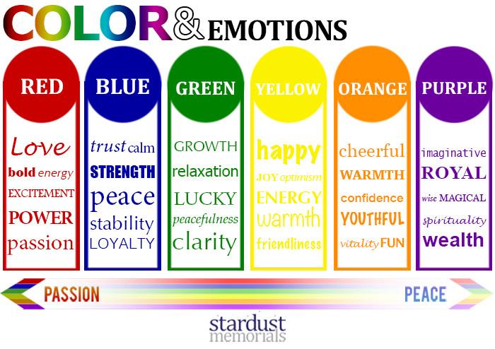
According to colour psychology there are colours with strong passion and there are those with a sense of deep peace.
In general, people assosiate red with energy, excitement and power; blue is associated with stability, trust and loyalty while green is the expression of relaxation, peacefulness and clarity; yellow and orange are regarded equel to happiness, joy and fun.
Слайд
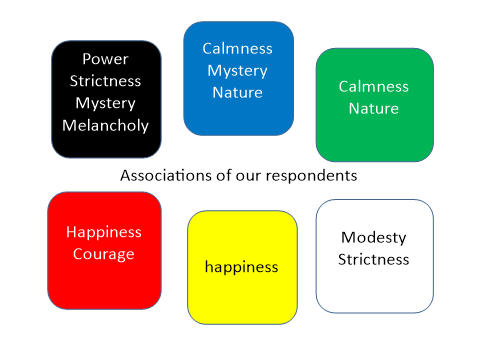
We have asked our participants to associate their favourite colours with some concepts. The results are on the slide.
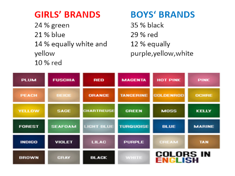
Black- power,strictness, mystery, melancholy
Blue - calmness, mystery, nature
Green- calmness, nature
Red - happiness, courage
Yellow- happiness
White- modesty, strictness.
Слайд 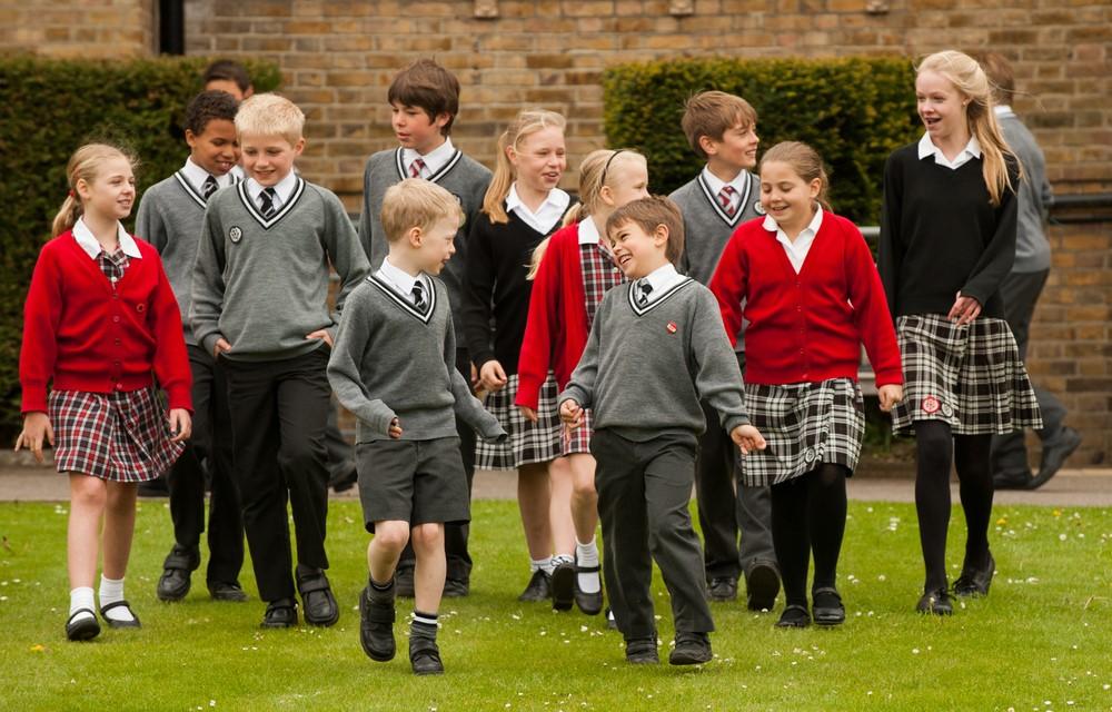
Another question in our survey was connected with preferable colours in clothes, because the clothes we wear communicate something.
Each choice tells the world something about your personality. The color of our clothes can change how we feel. Research says the fastest little fix for a bad day is to wear brightly colored clothes.
Happy colours can improve how we feel and how much energy we have.
Слайд
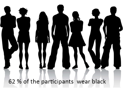
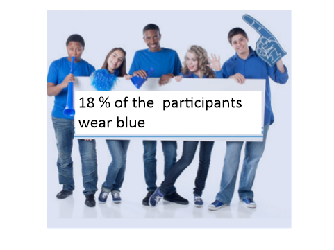
According to our survey more than half of the participants wear mostly black. It makes up 62%. 18% of teens wear mostly blue.
Слайд
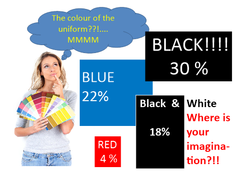
It was interesting to know what colour uniform our paticipants would choose for our gymnasium to feel more comfortable. Besides, we have found out what colour they would choose for the walls of the classrooms in order to feel at ease. Let's look at the results.
As for the uniform, most teenagers chose black (30%), some of the respondents chose blue (22%), black and white (18%) and even red (4%). It shows that black prevails again in teen's life.
Слайд
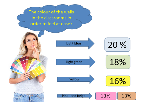
As for the colour of the wall in the classrooms, the results are the following:
39% chose light blue
36% chose light green
32 % chose yellow
26% equally chose pink and beige.
Слайд
The next goal of our research was the fact that colour psychology is also widely used in marketing and branding.
Companies also use colour when deciding on brand logos.
Quicksprout University ( an online training program) states that colour accounts for 85% of the reason that people choose to purchase a particular product and colour increases brand recognition by 80%.
Look at some famous brands which use colour psycology in marketing:
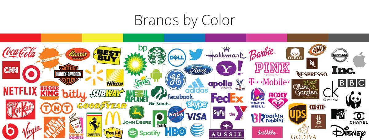
Black is a synonymous to power and luxury. It can give people a sense of establishment and trust. Simplicity can engender confidence.
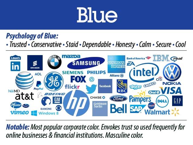
Blue is calming and clean, and consistent. That’s why we like blue, and why we feel ready to trust blue brands.
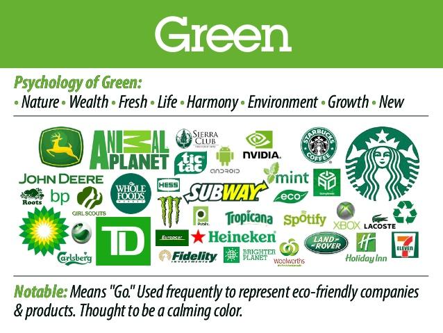
Green is the colour of growth, the colour of spring, the idea of a paradise island. When things are green, people are relaxed.Health and nutrition brands use green.
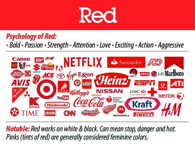
Red makes our pulse race. Red stimulates the appetite. YouTube and Netflix use red to fuel your appetite for more content. Heinz and Coca-Cola do the same in food and drink. Red is the most manipulative colour .
Слайд
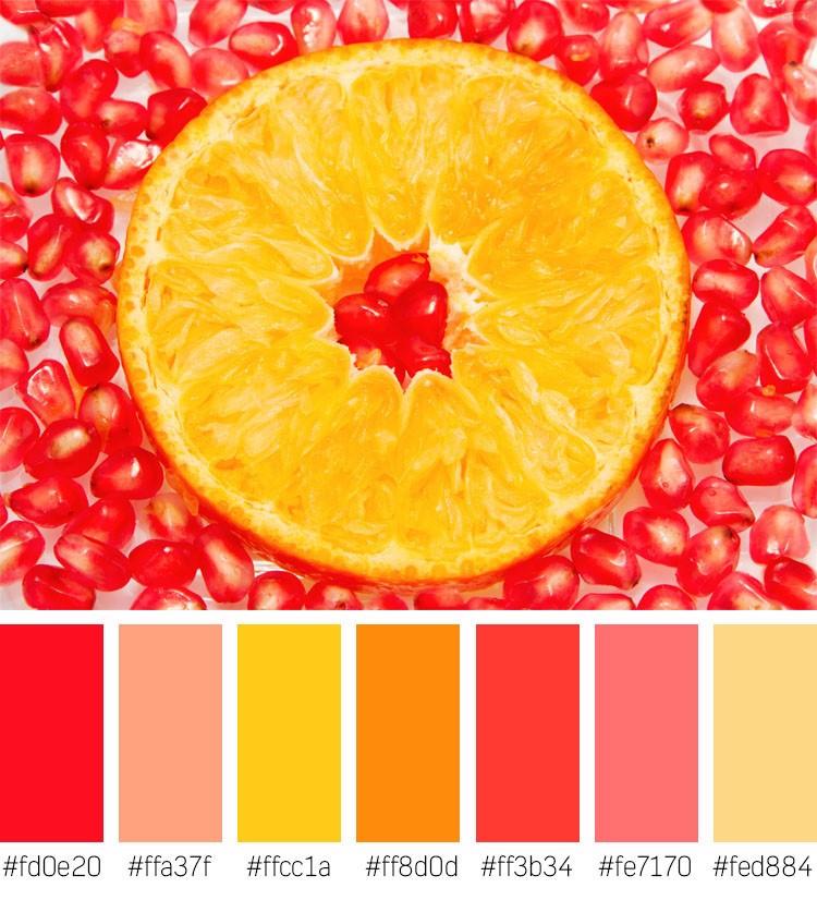
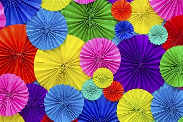
By connecting multiple senses, like vision and taste, color becomes an even more powerful tool.
Can you feel happiness, passion looking at this picture? Can you feel the taste of orange and grenade? Have you started salivating(Появилось слюноотделение?) Well, we can consider that we have achieved our goal to show you how senses and colours influence us.
Слайд
We have asked our participants what colour they would choose for their brands. The answers are presented on the slide.
Слайд

The last task in our survey was a button colour test where the participants should have chosen so called “call-to-action” buttons, in our case they were red and green. The resuts showed that 100 % of participants chose green (though the sites were the same) saying that a green button gives them a sense of safity, it is more friendly than a red button.
Conclusion
We have seen and showed to you the portrait of just a small group of teenages and the survey revealed us some interesting facts about it.
More over, the research unlocked us an exciting world of colours and taught us some valuale things which we are going to use in our life and further in our future profession.
It showed that the psychological and physiological effects of colour are apparent in everyday life.
Colours benefit our mental and physical welfare. It is extremely important to understand how colours affect us, and the careful attention that must be paid when designing, using or wearing things.
Resources:
https://seopressor.com/blog/psychology-of-color-in-marketing/
https://www.fastcompany.com/3009317/why-is-facebook-blue-the-science-behind-colors-in-marketing
https://blog.hubspot.com/marketing/psychology-of-color


 Проектная работа "The Power of Colours" (2.23 MB)
 0
0 283
283 11
11 Нравится
0
Нравится
0


